
I’ve received some feedback over the course of the LAW season that the APR data is useful and interesting and people find it useful and appreciate having it. I’ve also received some other feedback, which is that a bunch of static line charts embedded in a WordPress article is, to put it charitably, not exactly content creator-friendly. Apparently when your analytical methodology produces images that aren’t easy to zoom into, click on, or interact with in any meaningful way during a video, people are somewhat less excited about sharing them. I am told this with some regularity.
So. Here we are. The APR Dashboard is now live at swu.report/meta-apr-overview/.
If you’ve been reading the weekly analysis articles, you already know what APR is. If you haven’t, the short version: Adjusted Performance Rate is a two-stage log-normalized metric that measures how efficiently an archetype from field presence into top 8 appearances (Stage 1) and top 8 appearances into wins (Stage 2). The methodology piece is here if you want the full picture.
Here’s a walkthrough of what’s on the page and what each piece of it is actually for.
A Note on the Data Sources
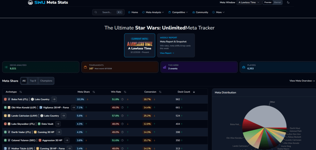
The weekly recap articles were built on a combination of two data sources: SWU Competitive Hub for T8 and win counts, and SWU Meta Stats for field estimates. When I started the article series, I was pulling from the Hub exclusively, but I quickly realized the Hub doesn’t expose full field registration numbers: just attendance and top 8 results. That led me to Meta Stats, which tracks registered decklists across a broader set of events.
Thankfully, that solved one problem and created another. The Hub and Meta Stats don’t count from exactly the same timeframe or apply the same eligibility cutoffs, which meant I was reconciling two sources with slightly different denominators every week (not the most fun part of the analytical process, it bears noting). The weekly articles represent my best effort at that reconciliation, and the trends are accurate. But the exact numbers vary slightly depending on which source you’re looking at.
To that end, the dashboard going forward pulls straight from the SWU Competitive Hub API, which is considerably easier to work with and gives us clean, consistent data without the reconciliation step. That means you may notice small discrepancies between specific numbers cited in the weekly recap articles and what the dashboard shows for the same archetypes. The trends and relative rankings should be consistent across both, but if you’re cross-referencing exact field counts, that’s why they don’t match perfectly.
When the ASH competitive season gets underway, a new page and a new data sheet will go live, and the LAW page will be archived and available for reference.
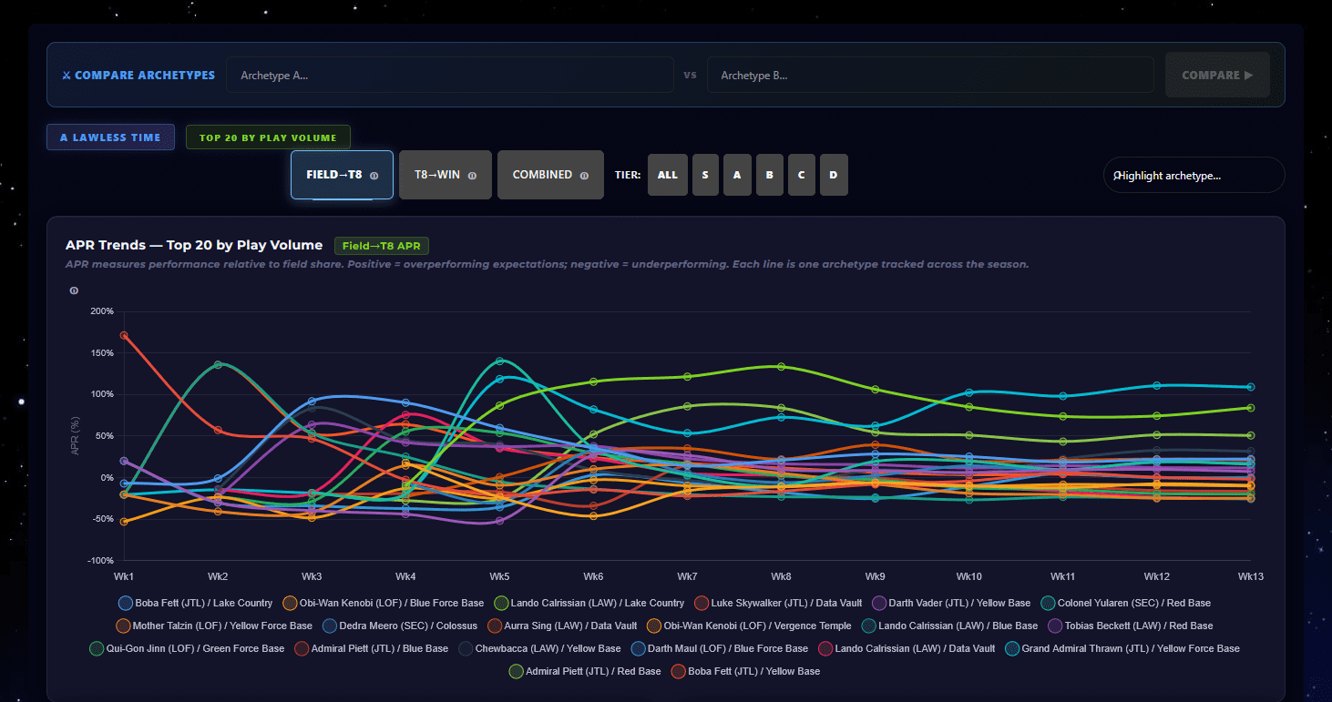
The APR Trends Chart
The line chart at the top of the page is the most direct translation of the weekly analysis into interactive form, showing the full season arc for the top 20 archetypes by field share with Field to Top 8 APR and Top 8 to Win APR as separate trend lines across each weekly snapshot.
This is where the season’s narrative lives. You can see Lando/LC’s F→T8 line settle into its dominant plateau early on and, of course, barely move for the rest of the season. You can see OB/Blue Force’s Stage 2 flatline in negative territory and stay there. You can see Aurra/DV’s mid-season surge, Dedra’s slow upward climb through the second half, and the post-Prague snap-back in the epilogue. The trend chart is, in a similar vein to the weekly recaps, the most honest single view of what the season actually looked like as it unfolded rather than as a summary after the fact.
Current Rankings and Stage Analysis
The Current Rankings bar chart shows every tracked archetype’s current-snapshot F→T8 and T8→W APR side by side, sorted by entry performance. It’s the fastest way to see the full spread at a glance and identify which archetypes are strong at one stage and not quite so strong at the other.
The Stage Analysis panel breaks down the tracked archetypes by stage profile: strong entry / strong close, strong entry / weak close, weak entry / strong close, and weak entry / weak close. The Population vs Performance bubble chart lives here too, with field share on one axis and T8 APR on the other, with bubble size proportional to T8 appearances. It’s particularly useful for seeing which archetypes are overperforming their field weight and which are getting to top 8 in spite of low registration rather than because of it. Conveniently, you can click any bubble to pull up a full archetype spotlight with the underlying numbers.
The Donut Charts and Meta Movers
There are two donut charts side by side: Field Share Distribution and Event Win Distribution. The pairing is solid. An archetype whose win donut slice is noticeably larger than its field donut slice is closing above expectation. The opposite is also true. These are a couple of the metrics that most players have the most familiarity with examining and it just did not feel right to exclude them from the dashboard.
The Meta Movers widget tracks week-over-week changes in APR, with significant movers flagged in both directions. This is the most useful piece of the dashboard for catching things the static current-snapshot view misses. An archetype that had a big week won’t necessarily lead the rankings if its cumulative baseline is mediocre, but it’ll show up as a top mover. Think of it as the early-warning system. Particularly useful mid-season when cumulative numbers are still settling.
The HHI Panel
The Herfindahl-Hirschman Index (HHI) is a market concentration measure borrowed from economics, applied here to the competitive meta. It answers a simple question: how concentrated is the top 8 environment? A fully open meta where wins are spread broadly produces a near-zero score. For our purposes, the dashboard uses these bands:
- 0–10: Open: wins distributed broadly
- 10–20: Healthy: some concentration, format competitive
- 20–35: Moderate: a few archetypes dominating
- 35+: Concentrated: format potentially warping
The HHI mini chart shows the season arc. The LAW season spent most of its middle weeks in the healthy-to-moderate band, which is, thankfully, about where you’d want it. It’s not a perfect tool (the index is sensitive to sample size, which is why there’s a 200-entry gate before the value is treated as meaningful), but it’s a useful additional lens on format health alongside the APR numbers.
And who knows, I’ve had to modify this some to come up with a way to apply it to a competitive card game and create some meaningful band cutoffs. Some of that is based on intuition right now. We might discover that it needs adjusted as time goes on. Or we may discover that it does not end up being as useful of a metric as hoped.
Stage Gap and Win O/U
The Stage Gap chart shows the delta between an archetype’s two APR stages. Negative means a worse closer than opener. Positive means the opposite. Sabé/DV, Thrawn, and Piett/Red all show strongly positive stage gaps, meaning they’re better in elimination rounds than in Swiss. OB/BF shows the most negative gap in the dataset, which will surprise approximately no one who read the weekly articles.
Win O/U is the simpler version of the same read: given an archetype’s T8 appearances and the season win rate, how many wins would you expect? Boba/LC runs a positive O/U despite modest closing APR simply because of the beefy volume of T8 appearances he generates. That’s the workhorse story in a single number.
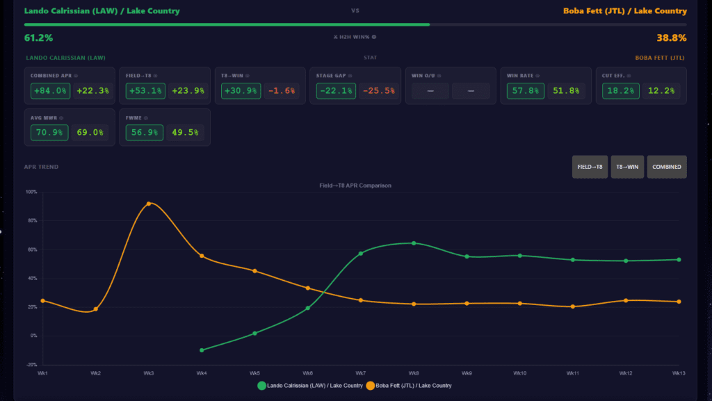
Spotlight and Head-to-Head
Another important item is that you should be able to click on the archetype in any of these charts we’ve been looking at and pull up a spotlight view on that specific deck which will let you take a look at the trendlines for it and a variety of individual stats from the deck’s current seasonal APRs, to Stage Gap, to Average Matchup Win Rate and more. Make sure to hover over the small question mark icons for explainer text on what each stat means.
The sticky comparison bar at the top of the dashboard is the feature I’m most excited about. Type any two archetypes into the search inputs and hit Compare, and the panel populates with a side-by-side breakdown of every tracked metric: field count, T8 appearances, wins, both APR stages, and win O/U. It’s particularly convenient for the kind of “but how does X actually compare to Y” discussions that come up constantly in community spaces. The winner in each comparison is highlighted in the color coding for that deck as seen in its title on the H2H panel. I think this could be fantastic for any content creators looking to analyse the meta, or a player trying to make the final decision on what they take to an important event.
As always, the numbers describe tendencies across large samples rather than deterministic outcomes at individual events. They’re a tool, not an answer. But they’re a considerably more interactive tool than a static chart embedded in a WordPress article, and I’m told that matters.There you have it.
Head over to swu.report/meta-apr-overview/ and have a look around.