
Friends, we need to talk about something that’s been bugging me for a while now, and it only seems to be getting worse each time I see a new alternate art treatment. Now, before anyone jumps down my throat about being a curmudgeon who doesn’t appreciate beautiful card art – trust me, I love gorgeous cards as much as the next player. But there’s a fundamental difference between cards that look amazing and cards that communicate game information clearly, and right now, SWU is prioritizing the wrong one.
The Foundational Issue
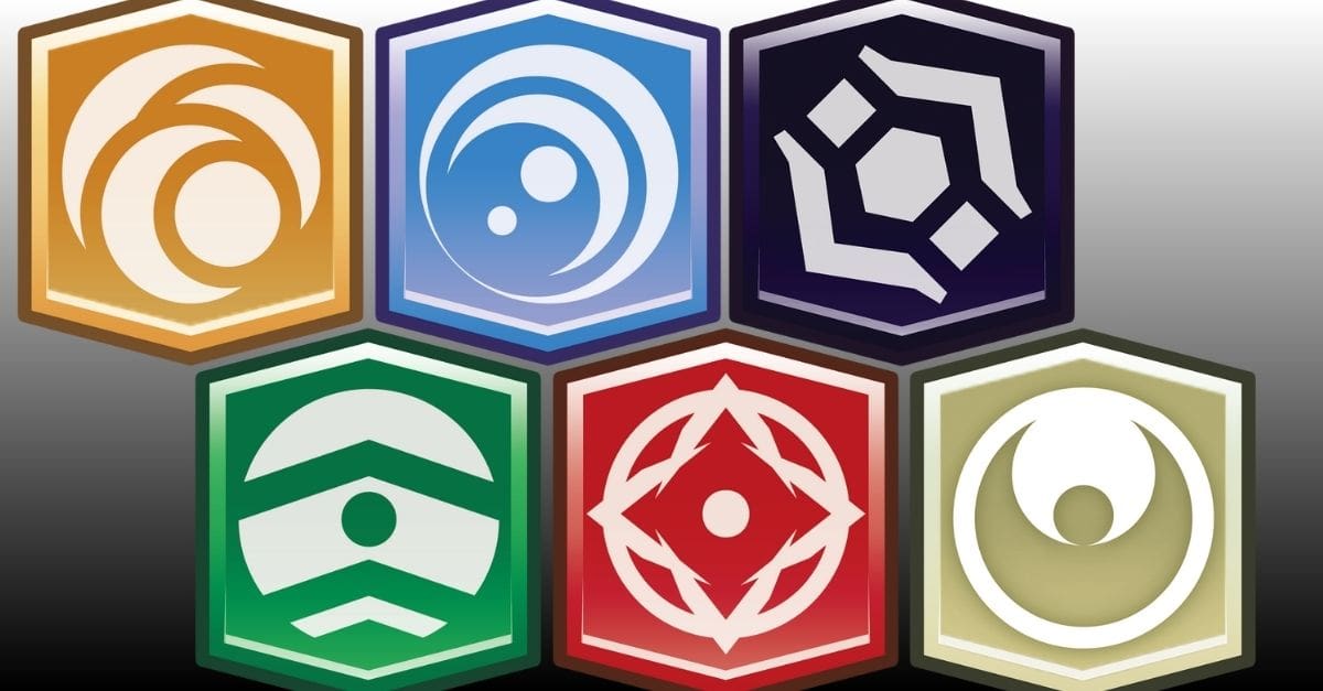
Let me start with the biggest underlying issue: SWU’s aspect icons are, frankly, terrible from a game/graphic design perspective. I’ve been playing competitive card games for over two decades, and I genuinely cannot describe the Vigilance, Command, or Cunning symbols to you without looking at them. That’s a massive red flag. (Ok, I can’t describe the other aspect symbols either.)
Compare this to other games I’ve played extensively. A Game of Thrones uses house sigils that are immediately recognizable as real world objects: lions for Lannister, wolves for Stark, roses for Tyrell. Even if you’ve never read the books or watched the show, these symbols carry intuitive meaning that make them easy to remember. Magic: The Gathering’s mana symbols are brilliantly simplistic: a water droplet for blue, a flame for red, a tree for green. These are also clear and intuitive indicators that players can mentally associate with recognizable concepts. They’re functional design elements that help players process information quickly.
SWU’s aspects on the other hand? Vigilance is… some kind of bubble? Command is… a mountain front of the sun? Cunning looks different from both but I honestly couldn’t recreate it from memory. This is problematic for all players, but it becomes a serious accessibility issue for folks dealing with neuro-atypical conditions or visual processing challenges.
Good game graphic design should be inclusive, not just pretty. Instead, we got abstract geometric shapes that mean nothing to anyone outside the context of the game.
Color As Indicator
Now, the usual indicator that goes hand in hand with unique faction icons in a game is an associated color for that icon and often the frame and overall direction of the card art. Given the weakness of SWU’s aspect iconography, color becomes absolutely critical for gameplay functionality.
And here’s where the game actually got something right initially – the aspect colors are distinct, consistent, and meaningful. Red for Aggression feels right, blue for Vigilance works, green for Command is fine. When you’re staring across a table at someone’s board state, those colored borders let you process threat assessment and legal plays quickly.
This is where my early qualms with alternate art promos and treatments started to really come into focus. Take the Sector and Regional promos, for instance. They do away with the vast majority of that color coding that makes it easy to see at a glance, but they do at least have colored aspect icons, so there is something to reference, even if it is a bit small.
Off Color Disasters
There are other cards, though, that create an even worse problem.
Take the convention exclusive droid promos for instance. Sure, I’ll agree with everyone that those schematics styles and flat design aesthetic really pop. But here’s the big thing: The coloration actively does not match the correctly associated colors for each aspect. BD-1 in a standard printing would be yellow for Cunning (looked that up to make sure), but is shown here in red, normally associated with Aggression.
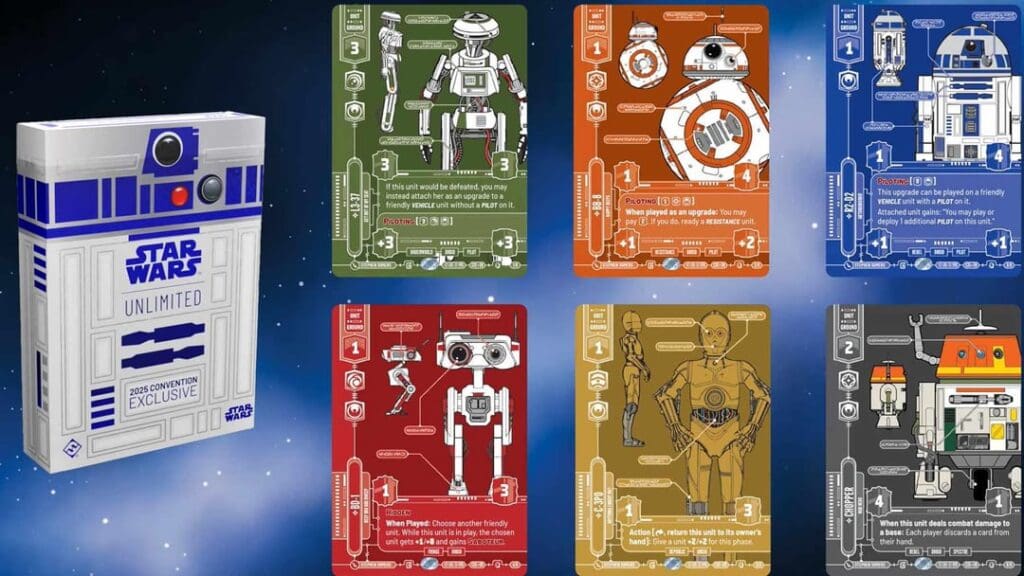
The convention exclusives are not the only ones that suffer from this issue. This type of mismatch slows down mental processing and assessment of the gamestate, which may be a small amount of time in any individual instance, but taken as a whole can really increase the amount of mental processing necessary over the course of a day long, or multiday event like the Galactic Championship.
The recently previewed Renegade style showcase cards for the upcoming Secrets of Power set actually compound this problem even more. No, they don’t have the truly heinous problem of mismatching colors, but they do leech applicable colors out so that neither the frame nor the aspect icons correctly depict the color. But here’s the thing that makes things worse; the prevalence. These are showcase cards, which are likely to have a much higher presence in decks than the even more limited stock of promos.
How much mental bandwidth do you want to expend at a tournament making sure that Lando player with full playsets of six different blinged out Renegade cards is properly paying for any applicable aspect penalties each and every time? And that’s just thinking of it from the perspective of what the average honest player has to keep up with. It’s also worth noting the opposite side of the scale that a less scrupulous corner shooting player might intentionally fill a deck with as many cards that obscure their aspect alignment as possible in the hopes that their opponents may not catch them when they underpay.
When you strip the color information out of both the borders AND the aspect icons, you’ve eliminated the two primary visual cues players rely on for quick information processing. Now players have to slow down, squint at tiny details, and work harder to parse basic game information. That’s the opposite of good design.
I keep thinking about players I know who already struggle with visual processing – friends who are colorblind, players dealing with various neuro-atypical conditions, folks who just have trouble with visual clutter. Poor graphic design on cards don’t just make the game slightly harder for them; they make certain game states genuinely difficult to parse. That’s not acceptable for a game that wants to build an inclusive competitive community.
Accessibility Mindfulness
Here’s what really gets me fired up about this; we’ve had decades of research and practical experience showing how to make games more accessible through thoughtful graphic design. Companies like Fantasy Flight Games have generally been leaders in this space, understanding that good design serves all players better.
Look, I know that at this point in the game, they sure aren’t going to change the aspect icons to make factions easier to grok at a glance. We’re stuck with that part of things and I am sorry for colorblind players. But there are still easy ways to make recognition better for the large portion of the playerbase with full color spectrum visual abilities. Keep the functional color information intact while getting creative with borders, textures, or other visual elements that don’t interfere with gameplay.
Good Design
The frustrating part is that SWU gets so many other design elements right. The dual-sided leaders are brilliant both functionally and aesthetically. The base cards effectively communicate their mechanical differences through visual design. Even the regular card layouts do a good job balancing information density with visual appeal.
When SWU sticks to its core design principles (clear color coding, consistent iconography, functional layouts) it creates cards that are both beautiful and highly playable. The problems only emerge when special treatments prioritize visual impact over gameplay clarity.
Good game design should enhance the play experience, not complicate it. Players should be able to focus on strategic decisions rather than struggling to parse basic card information. When graphic design choices make the game harder to play, especially for new players and those dealing with accessibility challenges, we’ve lost sight of what matters most.
Moving Forward
Look, I don’t want to just complain without offering solutions. There are ways to create stunning special cards that maintain gameplay clarity. Use unique border treatments, special foiling patterns, or artistic variations that preserve the essential color and icon information. Create premium versions that feel special without sacrificing function.
The SWU design team has shown they can create incredible-looking cards when they focus on both form and function. I’d love to see future special releases that wow players visually while still supporting the smooth gameplay experience that competitive players need.
More broadly, I hope this conversation contributes to better awareness of accessibility issues in game graphic design. We have the knowledge and tools to create inclusive experiences that work for all players. It’s just a matter of prioritizing function alongside form, and remembering that the most beautiful card in the world is worthless if players can’t use it effectively.
The game is too good, and the community is too important, to let graphic design missteps undermine the incredible strategic depth that makes Star Wars Unlimited special. Here’s hoping future releases remember that clarity isn’t the enemy of beauty, it’s the foundation that makes true beauty possible.
Now if you’ll excuse me, I need to go squint at some cards and try to figure out which aspect they’re supposed to be before tomorrow’s PQ.